Would you be able to name every type of logo on the spot? There must be millions of styles, right? WRONG
But before we break it down what is a logo?
A logo is a symbol or design used to identify a company or organization, as well as its products, services, employees, etc. In its simplest definition, a logo identifies. It’s how your company is recognized and remembered among others.
The logo format you choose can be strategically aligned with the brand you are working with. When we are creating brand books, logos or identities for our food and beverage clients we start with presenting them the 6 basic styles that we work from. Here they are with some samples.
WORD MARK LOGO
Logo with the letter mark What is the word mark consisting only in type and is typically in a uniquely style logo the letter mark consist of name abbreviated and Inc no symbols, mascots, or badges. Wordmark logos are also called “logotypes,” and can include monogram logo variations for smaller spaces like social media profiles and favicons.
LETTER MARK LOGO
Name abbreviated and interoperated into the design. Lettermarks, like wordmarks, are logos that are made up of letters, usually the initials of your brand. By utilizing just a few letters lettermark logos are effective at streamlining any company brand if they have a long name.
ABSTRACT LOGO
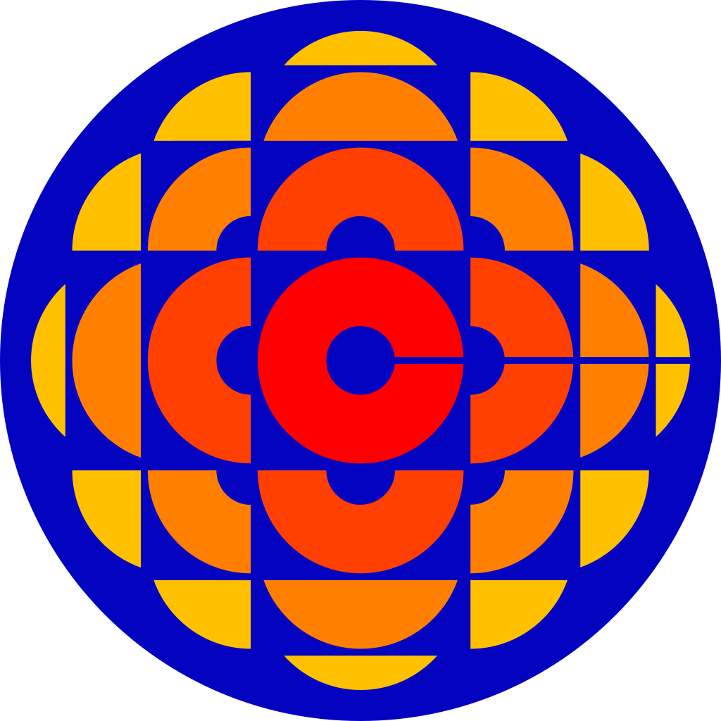
An abstract logo is a symbol or image that isn’t necessarily recognizable, but rather a complex geometric shape that represents your business in a conceptual way. More importantly, abstract logos are able to infuse layers of meaning into an image, making yours a memorable, conversation-starting logo and sometimes they mean nothing at all. Nike anyone? The current era of logo design began in the 1870s with the first abstract logo, the Bass red triangle. Thanks to the introduction of color printing and the advertising industry, logos became essential for brands if they wanted to be memorable to potential customers.
![]()
Bonus – CBC abstract logo was created way back in 1940
PICTORIAL LOGO
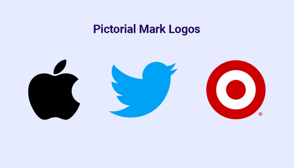
Similar to the abstract logo but it something that we can easily reconize. are made up of graphics that visually represent the brand name or function. These can be icons, illustrations or shape compositions that are instantly recognizable as something specific. Twitters famous bird and now its X are great examples of these logos
CHARACTER / MASCOT LOGO
COMBINATION LOGO
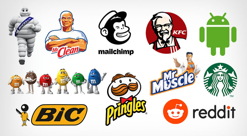
A combination logo integrates both logotype and logomark elements into a single cohesive design. By combining text with images or icons, this type of logo strengthens the brand message and provides clarity about the nature of the business. It’s important to note that combination marks can exist either as integrated designs or as standalone entities.
SAMPLE CALL OUT
Searching for a burger in Canada? The iconic Harvey’s logo has been a memorable symbol for Canadians since 1949. To this day, nearly all of its nearly 300 locations are located within Canada. Yum!
SAMPLE CALL OUT
Jarritos Canada holds a special place in our portfolio as one of our enduring partnerships. While it’s true that we didn’t craft the original brand book or design the logo, it serves as an excellent illustration of a combination logo. Interestingly, “Jarritos” translates to “clay jars” in Spanish, a subtle yet meaningful detail embedded in the logo itself. Have you ever noticed the clever incorporation of clay jars in the design? It’s a testament to the thoughtfulness and cultural richness that defines our collaborative work with Jarritos. We have created some logos for the Jarritos campaigns. Check out the 2 seasons of the Jarritos taco tour. (Sheild logo)

SHEILD LOGO
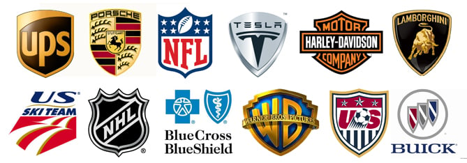
Similar to combination mark logos, emblem logos combine images with text. The difference? Emblem logos encapsulate their design features within a frame or border. Combination logos do not. Emblem logos also rarely use a mascot. Shield logos are some times seen as a symbol of law enforcement agencies or schools and universities The emblem subconsciously adjusts the potential client to the fact that he will be guarded or trusted.
As you shape your brand’s identity, remember the power of a great logo. Our agency has years of experience crafting logos and creating brand books. Many famous restaurants and food brands feature logos from our portfolio. Choosing us means more than just getting a design service; it means capturing your brand’s spirit and connecting visually with your audience. It’s the start of our journey together.

