The Age of Greige: Why Food Brands, Restaurants, and Kitchens Are Playing It Safe with Colour
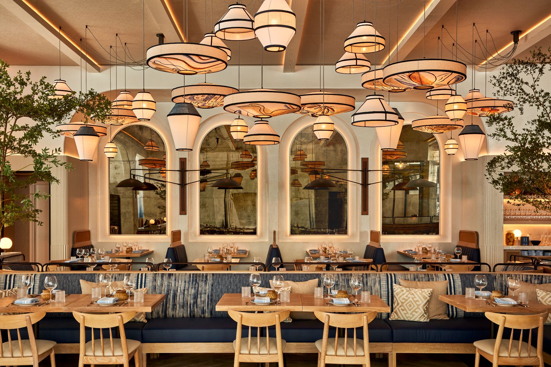
Walk into a newly opened restaurant, scroll through a food brand’s Instagram, or browse new kitchen appliances and one thing is clear:
colour is quietly disappearing.

Beige walls. Off-white tiles. Stone countertops. Cream espresso machines. Neutral menus. Muted packaging.
Pantone’s recent choice of Cloud Dancer — a soft off-white — as a defining colour for 2026 didn’t create this trend, but it confirmed what the food and hospitality industry has already been signalling for years.
The question for food brands isn’t why neutrals are popular.
It’s what happens when everyone chooses safe.

Why Restaurants and Food Brands Are Going Neutral
1. Neutrals Reduce Risk in a High-Cost Industry
Restaurants are expensive to build and even more expensive to redo. Neutral interiors age slowly, photograph well, and don’t scare off future tenants, buyers, or investors.
White tile, light wood, brushed steel, and linen menus feel timeless — and in a low-margin industry, timeless equals survival.
Just like neutral-coloured cars hold resale value, neutral restaurant spaces are easier to refresh without starting from scratch.
2. Calm Spaces Counter a Loud Digital World
Food is consumed visually before it’s eaten — on Instagram, TikTok, Google, and delivery apps.
Screens are saturated. Feeds are frantic.
Neutral restaurant interiors act as visual relief:
Food photography pops more
Plates become the colour
Guests feel relaxed, not overstimulated
Minimalism isn’t laziness — it’s a reaction to digital overload.

3. “Quiet Luxury” Has Entered Food Branding
Neutrals have shifted from practical to aspirational.
In food and beverage branding, beige now signals:
Premium ingredients
Confidence without shouting
Craft over chaos
You see it in:
Matte cream espresso machines
Stoneware plates
Tonal wine, spirits, and pantry packaging
Restraint has become a status symbol.
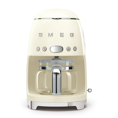
The Appliance Effect: Why Kitchens All Look the Same Now
Commercial and home kitchens are increasingly uniform:
White or stainless appliances
Minimal logos
Soft control panels
Neutral finishes
Manufacturers know bold colours narrow their audience. Neutrals sell to everyone.
For food brands, this creates pressure:
If the environment is neutral, the brand must do more work.
The Risk: When Safe Becomes Forgettable
When everyone chooses restraint:
Cafés blur together
Menus feel interchangeable
Instagram grids look identical
The rise of “sad beige” food spaces isn’t just about calm — it’s about fear of judgement.
Fear of:
Being dated
Being criticised online
Making a bold choice that doesn’t land
But food is emotional. Cultural. Expressive.
When everything is neutral, nothing is memorable.
Branding & Buzzing POV: Where Brands Get It Right
The strongest food brands don’t reject neutrals — they use them strategically.
They:
-
Keep spaces calm but add one unmistakable signature
-
Let ingredients introduce natural colour
-
Use storytelling, not paint, to show personality
-
Let digital content carry vibrancy while physical spaces stay composed
In other words:
The room whispers. The brand still speaks.
Final Takeaway
Neutral isn’t the problem.
Blending in is.
If you’re planning a refresh, a new opening, or a rebrand, the question isn’t “Should we go neutral?”
It’s “Where do we dare to be remembered?”