Mastering the Art of Logo Design for Your Food Brand
Creating a memorable and effective logo is crucial for any food brand. Your logo isn’t just a pretty picture; it’s a visual representation of your brand’s identity and values. It needs to be versatile enough to look great whether it’s on a billboard or a business card. In this blog post, we’ll break down the different styles and uses for your logos, helping you understand how to optimize each one for maximum impact.
1. Primary Logo: The Complete Package
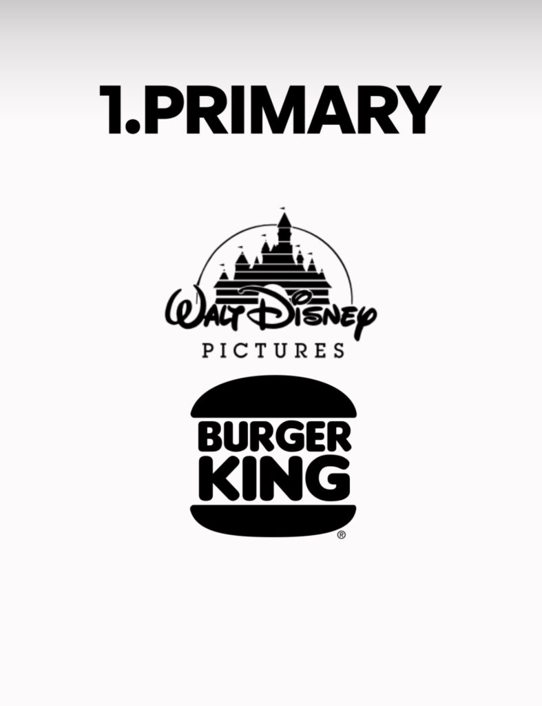
Your primary logo is the full, unabridged version of your brand’s visual identity. It includes all the elements that make your brand unique:
- Motifs: These are decorative elements that complement your logo and enhance its visual appeal.
- Illustrations: These might be detailed images or drawings that add character and context to your logo.
- Mascot: If your brand has a character or figure that represents it, this should be part of your primary logo.
- Taglines: A concise, memorable phrase that encapsulates your brand’s message or value proposition.
When to Use: This complete version of your logo is ideal for high-impact touchpoints where space is not a constraint. Think of places where your audience can take the time to appreciate the full design:
- Website headers
- Storefront signage
- Packaging (like large boxes or bags)
- Marketing materials (posters, flyers)
2. Secondary Logo: Simplified and Stacked

Your secondary logo is a more streamlined version of the primary logo. It’s designed to be clear and recognizable even when used in a more compressed format. The elements are stacked or rearranged to save space, but it remains fully legible.
When to Use: This version is perfect for medium-sized touchpoints where the full detail of the primary logo might be too overwhelming:
- Social media profile pictures
- Email signatures
- Smaller packaging (like small boxes or bags)
- In-app branding elements
3. Tertiary Logo: Minimalist and Compact
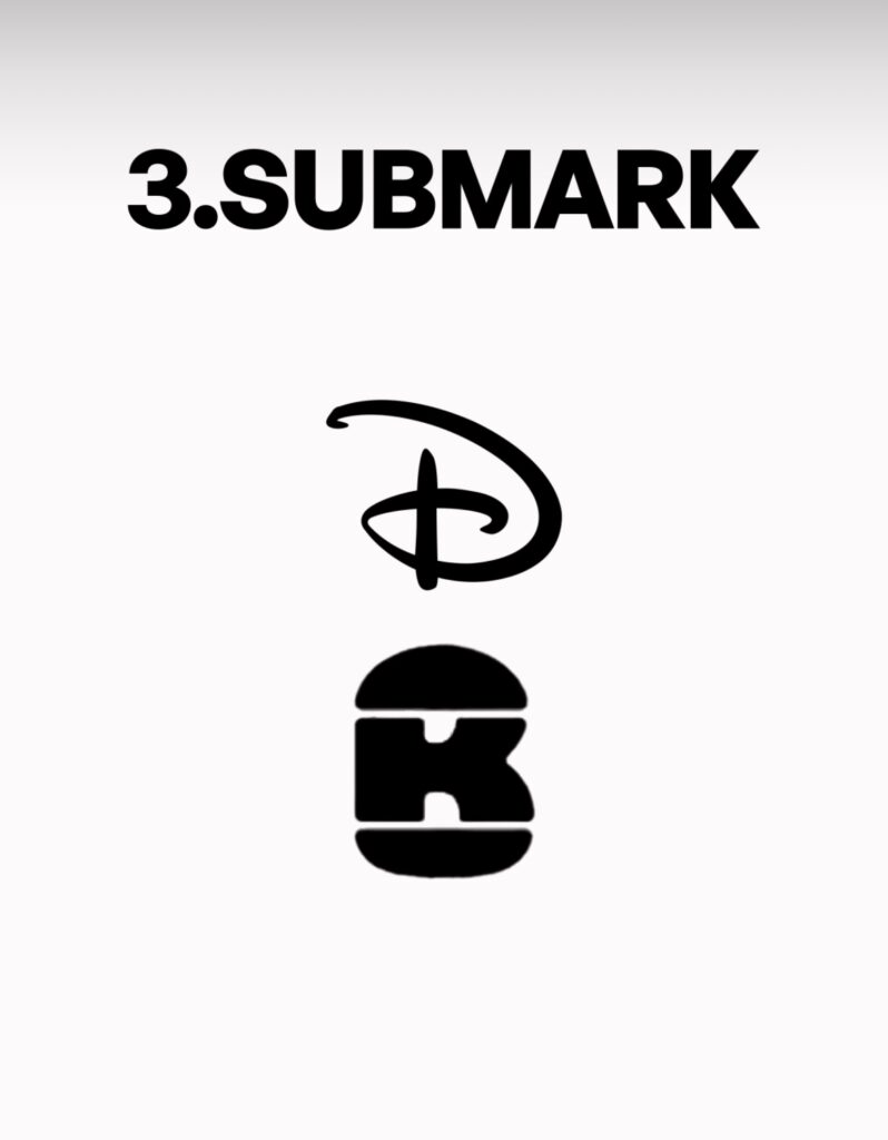
ScreenshotThe tertiary logo is stripped back even further. It maintains the essence of your brand but in a very minimalist form, focusing on the most critical elements to ensure legibility at small sizes.
When to Use: Use this version when space is extremely limited, but you still need brand recognition:
- Business cards
- Smaller social media icons (like in comment sections)
- Merchandise (like pens or USB drives)
- Digital ads where space is at a premium
4. Favicon: Tiny but Mighty
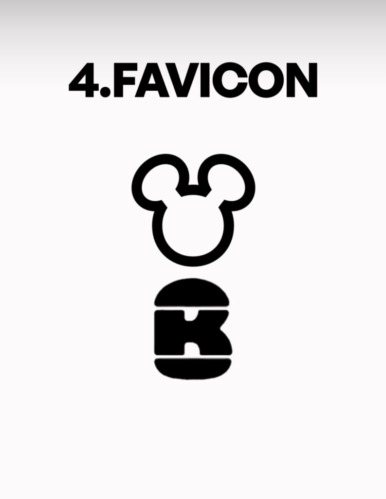
The favicon is the smallest and most simplified version of your logo. It’s designed to be legible at extremely small sizes, typically seen in the URL bar of web browsers.
When to Use: Favicons are used for the smallest digital touchpoints:
- Website URL bar
- Browser tabs
- Mobile app icons
- Bookmark icons
Understanding and utilizing these different logo styles ensures that your brand remains consistent and recognizable across all platforms. Each version of your logo has its place and purpose, from the detailed and elaborate primary logo to the tiny but mighty favicon. By using each one appropriately, you’ll create a cohesive brand identity that resonates with your audience, no matter where they encounter your brand.
Remember, the key to a successful logo strategy is versatility and consistency. Make sure each version of your logo is designed with care and consideration for its intended use, and your brand will leave a lasting impression wherever it goes.