The Power of Mood Boards in Branding
When it comes to branding, visuals speak volumes. At Branding & Buzzing, we rely on mood boards to bring brand identities to life. These carefully curated collections of colours, visuals, and words help bridge the gap between creative vision and strategic execution.

Why Mood Boards Matter
Mood boards serve as a foundational tool in our branding process. Once we have a clear understanding of a client’s key pillars—often gathered through interviews or our Brand Card exercise—we translate those insights into tangible aesthetics. This exercise allows us to visually map out a brand’s personality, ensuring alignment before diving into full-scale design work.
A Spectrum of Choices

We typically present clients with three distinct mood boards, each offering a different perspective on their brand identity.
One Safe Option – Grounded in their existing presence, refined but familiar.
One Bold Option – A creative leap that challenges the norm.
One Intuitive Option – Based on our gut instincts and industry expertise.
“Sometimes we give something safe and something wild, sometimes we go with our gut,” says Sean Beckingham, Parnter – Branding & Buzzing.
This approach allows us to push boundaries while keeping the client’s comfort level in mind. Once we present these boards, we walk our clients through why we believe they could work and how they reflect their brand’s essence.

Who Creates the Mood Boards?
Branding isn’t a solo effort—it’s a collaborative process. At BB, we work as a team, sharing ideas and files to ensure every project benefits from diverse perspectives. Having input from different generations allows us to create branding that is both timeless and trend-forward.
Additionally, formal training in art or history can be a major asset. Whether it’s a graduate of art school or a makeup artist with a keen eye for color theory, a strong artistic foundation plays a key role in crafting compelling mood boards. This blend of experience and instinct results in branding that is visually cohesive, strategically sound, and, most importantly, resonant with the target audience.
Case Study: Memorial Market Place, Belleville
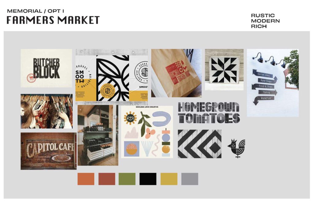
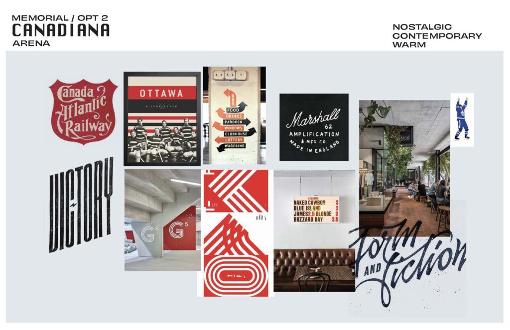
A great example of this process in action is our work with Memorial Market Place in Belleville, Ontario. Tasked with shaping the brand identity for this revitalized community space, we developed three distinct mood board concepts:
Farmers Market
Inspo Words: Rustic, Modern, and Rich.
This direction emphasized earthy tones and textures, evoking a welcoming and organic feel.
Canadiana
Inspo Words: Nostalgic, Contemporary, and Warm.
Inspired by classic Canadian heritage, this concept balanced tradition with a fresh, modern twist.

Artisan Road
Inspo Words: Refined, Sophisticated, and Clean.
A sleek and upscale aesthetic aimed at elevating the market’s perception as a high-quality destination.

We walked the client through each option, discussing the strengths of each and how they aligned with their vision. This collaborative approach ensured that Memorial Market Place had a brand identity that resonated deeply with its community while staying true to its historical roots.
Where did the land? You tell us
View this post on Instagram
The Final Takeaway
Mood boards are more than just pretty pictures—they are the visual translation of a brand’s essence. By combining strategic thinking with artistic intuition, we ensure that every brand we touch has a look and feel that aligns perfectly with its goals. And whether the final direction is safe, bold, or instinctive, the journey always starts with a board full of possibilities.
