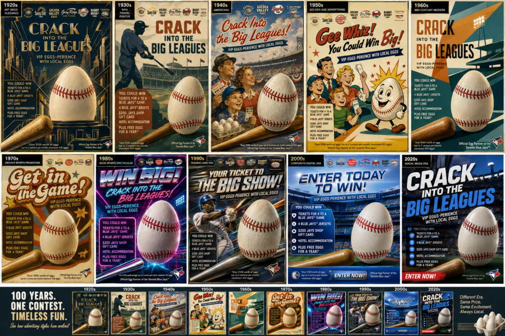
From Roaring Twenties to Digital Dominance
How One Contest Would Have Been Advertised Across 100 Years
Contest marketing has been one of the most effective promotional tools for over a century. From newspaper giveaways in the 1920s to influencer campaigns and AI-powered targeting today, contests continue to help brands drive awareness, engagement, and sales. In this article, we explore how the same contest might have been promoted across every decade of the past 100 years.
At Branding & Buzzing, we often remind clients that great marketing isn’t just about what you say it’s about how you say it.
To demonstrate that point, we took a modern contest campaign we created for our client and imagined how it would have been advertised in every decade from the 1920s to today.
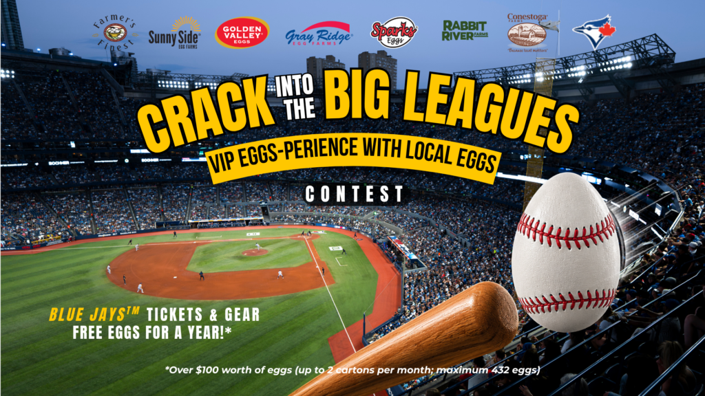
The promotion remains exactly the same:
Win a VIP Blue Jays Experience, hotel stay, merchandise, and free eggs for a year.
Current Campagin launch 2026
What changes is the design style.
1920s
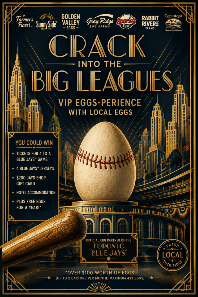
Art Deco Luxury
Design Direction
Think and AI prompt:
- The Great Gatsby
- Gold foil
- Geometric patterns
- Elegant typography
- Luxury travel posters
Visuals
Instead of a stadium photo:
- Art Deco skyscrapers
- Stylized baseball player
- Golden egg illustration
- Rich navy, gold and cream palette
Headline
“Step Into The Major Leagues”
The prize would feel exclusive and sophisticated rather than exciting.
1930s
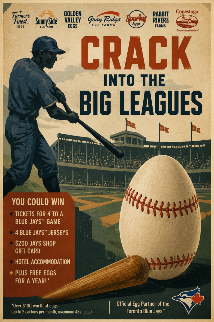
WPA Poster Era
Design Direction
Think and AI prompt:
- National park posters
- Railway advertisements
- Government work programs
Visuals
- Hand-painted baseball player
- Simplified city skyline
- Strong shadows
- Limited colours
Headline
“Win Your Journey To The Ballpark”
Everything would feel handcrafted and hopeful.
1940s
Wartime Americana
Design Direction
Think and AI prompt:
- Victory posters
- Norman Rockwell
- Patriotic advertising
Visuals
- Smiling family at a baseball game
- Realistic painted illustrations
- Red, white and blue
Headline
“America’s Favourite Pastime”
The egg would be positioned as wholesome family nutrition.
1950s
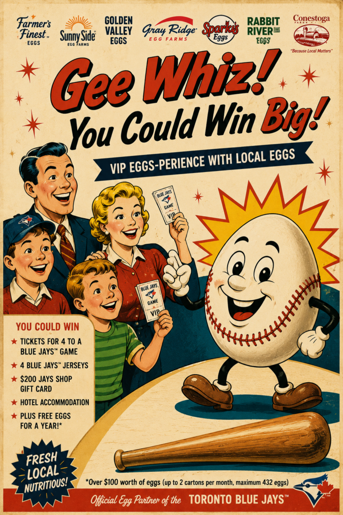
Golden Age Advertising
Design Direction
The era of:
- Coca-Cola ads
- Cheerful illustrations
- Optimism
Visuals
- Happy family
- Dad holding tickets
- Bright colours
- Cartoon baseball egg mascot
Headline
“Gee Whiz! You Could Win Big!”
This would be the most cheerful version.
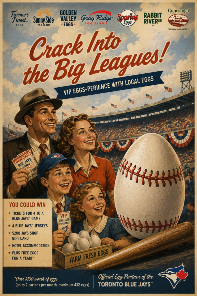
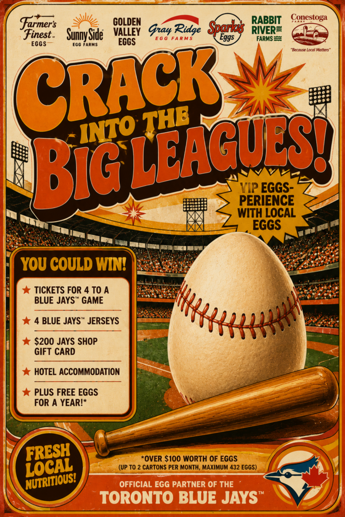
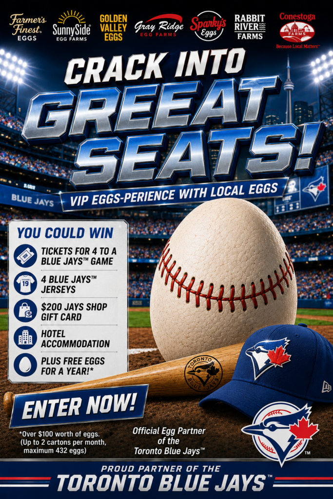
1960s

Mid-Century Modern
Design Direction
Inspired by:
- Saul Bass
- Airline travel posters
- Modernist advertising
Visuals
- Flat graphics
- Angular shapes
- Minimal illustration
Headline
“Crack Into The Big Leagues”
Simple. Clean. Bold.
Less clutter than the 1950s version.
1970s
Groovy Sports Promotion
Design Direction
Think:
- ABC Sports
- Retro sports cards
- Funky typography
Visuals
- Orange and brown palette
- Rounded type
- Baseball starburst graphics
Headline
“Get In The Game”
The design would feel energetic and playful.
1980s
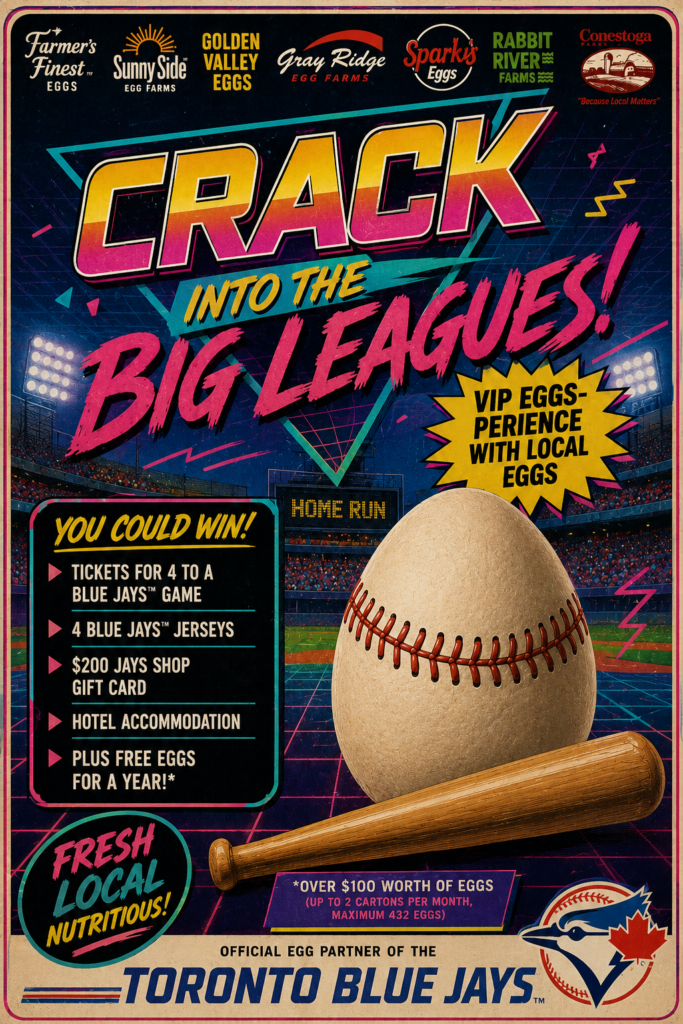
Neon Sports Spectacular
Design Direction
Inspired by:
- ESPN
- VHS graphics
- Arcade games
Visuals
- Neon pinks
- Electric blues
- Chrome baseball bat
- Speed lines
Headline
“WIN BIG!”
Everything would be larger than life.
The contest would feel like a video game.
1990s
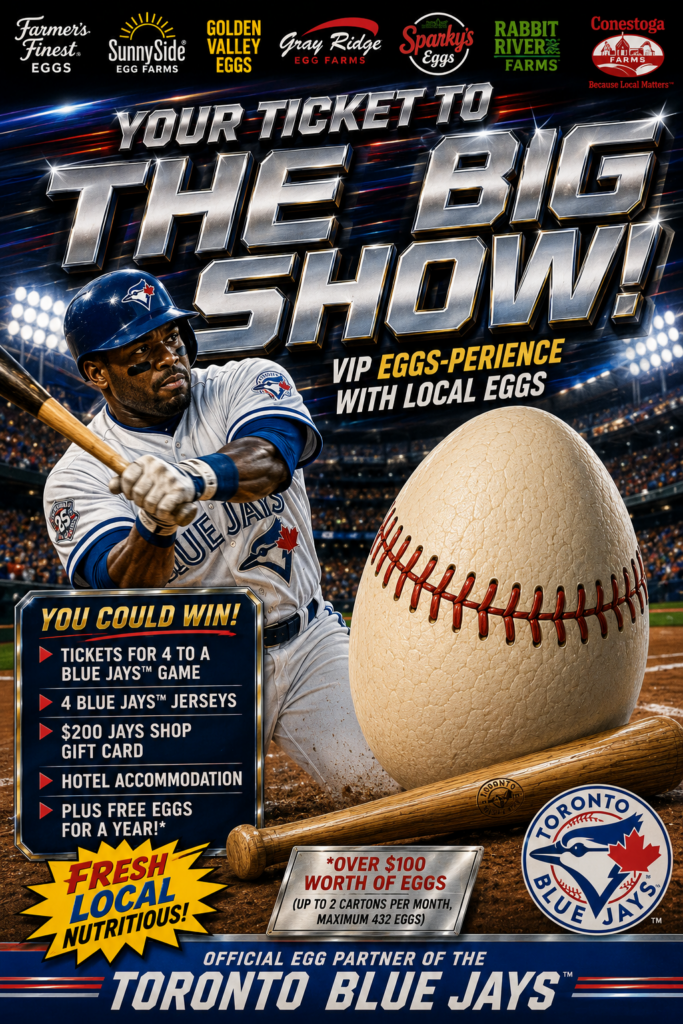
Sports Trading Card Era
Design Direction
Inspired by:
- Upper Deck cards
- Sports Illustrated
- Starter jackets
Visuals
- Action photography
- Metallic gradients
- Dynamic layouts
Headline
“Your Ticket To The Big Show”
This era loved excitement and athlete hero shots.
2000s
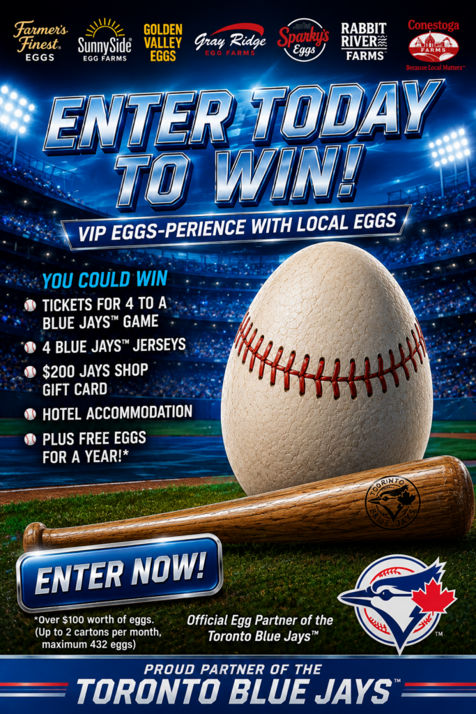
Peak Corporate Marketing
Design Direction
Inspired by:
- Early web advertising
- Corporate sponsorships
- Flash-era graphics
Visuals
- Glossy buttons
- Lens flares
- Blue gradients
- Product-focused design
Headline
“Enter Today To Win”
Function over style.
This was the era of information-heavy advertising.
2010s
Social Media First
Design Direction
The Instagram era.
Visuals
- Lifestyle photography
- Influencer-style content
- Cleaner layouts
- More white space
Headline
“Your Ultimate Blue Jays Experience”
The focus shifts from the prize itself to the experience.
The Big Lesson
The promotion never changed.
The audience never changed.
The prize never changed.
Only the way the story was told changed.
That’s the real challenge in marketing.
Understanding what resonates today while respecting the timeless principles of great advertising.
At Branding & Buzzing, we love studying the past because the best campaigns of the future are often inspired by the best ideas from history.
Written by Sean Beckingham, Partner at Branding & Buzzing. Sean has spent more than 15 years creating contest, influencer, experiential, and digital marketing campaigns for food, beverage, hospitality, and consumer brands across Canada.